
Overview
The product
Albridge Wealth Reporting
Albridge Wealth Reporting is the world's leading portfolio management tool that enables financial advisors to view essential performance data of their clients portfolios and create reports for client meetings.
My Role
Lead Product Designer
The Team
1 Product Manager
1 Design Director
2 Client Design Directors
1 Client Research Director
2 Client Researchers
2 Client Product Owners
1 Client Engineering Director
10+ Client Engineers
Client
Bank of New York Mellon
Company
Publicis Sapient
Project Type
Fintech, Product Design, UX Research
Timeline
Mar 2022-Feb 2023
Tools
Figma
Mural
My Impact
I was brought in as the lead product designer for a redesign of BNY Mellon's wealth reporting product, Albridge. The key objectives of the redesign was to decrease churn and increase new business.
After launching the redesign we successfully met these goals, earning strong metrics post-launch:
Increased assets under management from $2.4 trillion to $5.3 trillion
220% increase in new business
“I got congratulated one million times over the week and every time I thought of you all. I wish you could have been there to see your work shine like the sun.”

Brian Hamilton, Head of UX and Design @ BNY Mellon
I led several key tasks including:
Current state product analysis
Competitive analysis
User personas
Low to high fidelity wireframes
Visual design
Data visualization
Usability testing
Presenting and gaining client approval
Collaborating with and handing off to development team
I had a supporting role in:
User interviews
Research synthesis
Affinity mapping
Customer journey
This case study highlights the innovative solutions we developed to address these concerns and create a more engaging platform for Albridge users through world-class design.
The Problem
Albridge was losing customers fast.
Their product faced challenges related to usability and outdated aesthetics, which led to churn and loss of market share. Our team was responsible for enhancing Albridge's user experience to improve its functionality for financial advisors, as well as elevating visual design to create a positive impression on their clients.
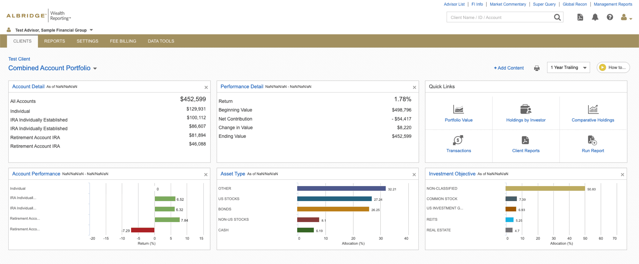
A screenshot of Albridge Dashboard prior to our redesign.

A screenshot of Albridge Portfolio Value page prior to our redesign.
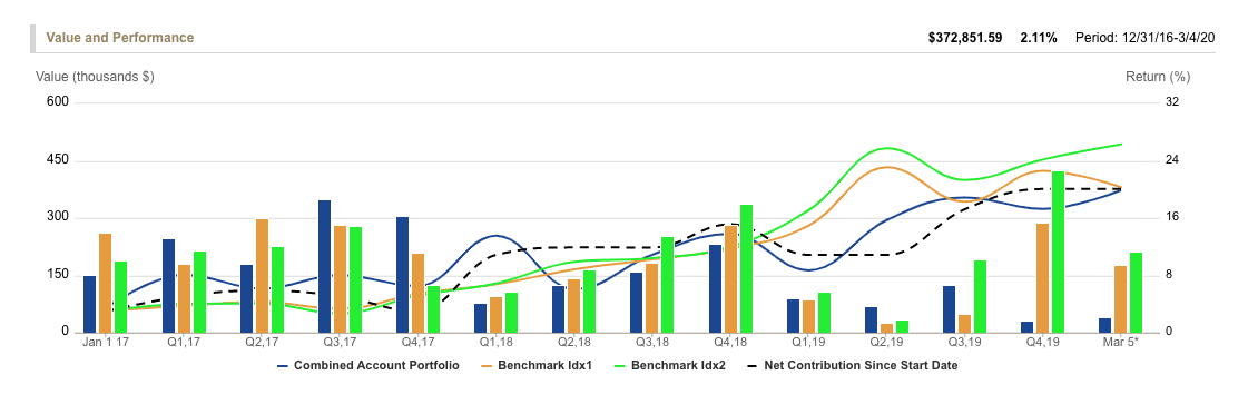
A screenshot of Albridge Value and Performance page prior to our redesign.
The Solution
Using research to drive our design solution, we were led to focus on four core themes:
Navigation
Data visualizations and data storytelling
Scalability to support different customer types and use cases
Modern UI patterns
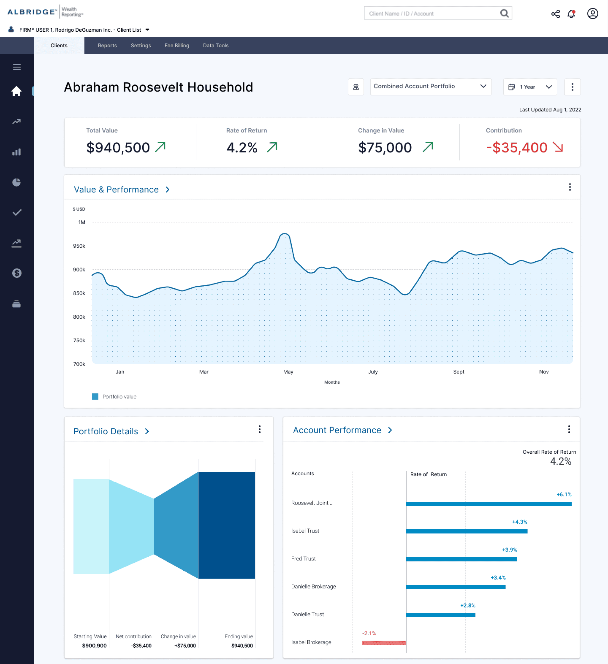
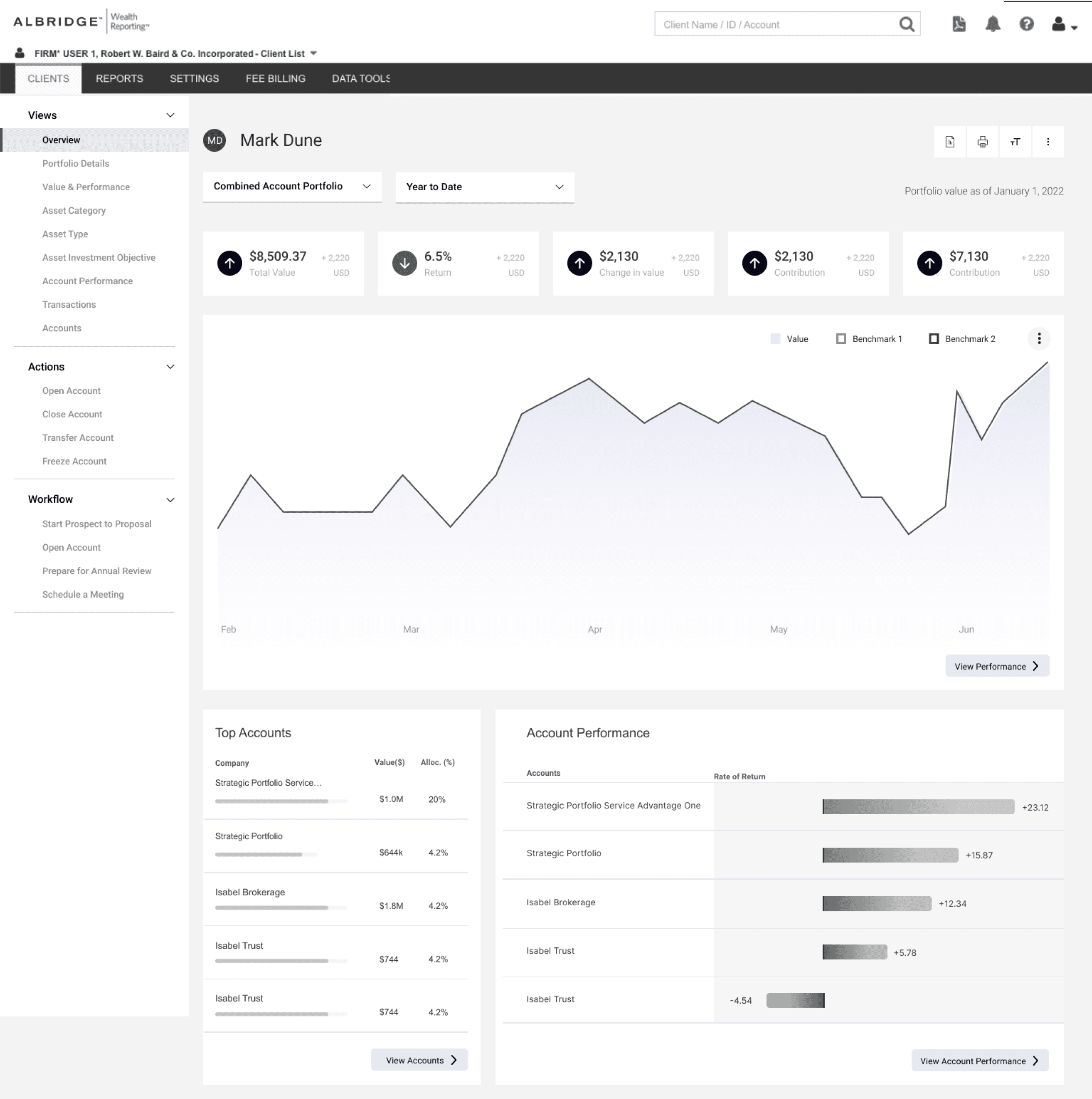
A screenshot of the Albridge dashboard after our redesign.


Start of section: The Process
Discovery Research
To understand the product space and problems we were aiming to solve, we used seven research methods to execute our discovery research:
Auditing the current state of the product
Auditing competitor products
Interviewing Albridge customers
Interviewing customers of competitor products
Affinity maps of what customers are saying, thinking, feeling and doing
Customer journeys
User personas
The insights derived from these seven research methods gave us a data-driven direction for our product redesign.
Auditing the current state of the product
Auditing competitor products

Interviewing current Albridge customers and customers of competing products


"The data doesn't feel very smart.
I wish I could interact with it more."
-Current Albridge customer
“Aesthetics are important because we give
client presentations with these tools.”
-Customer of a competing product


Affinity mapping of what customers are saying, doing, feeling and thinking


Customer journeys

User personas

Key Takeaways
(What needs to be solved in order for Albridge to regain traction)
1
Users need great usability and to be able to successfully navigate the software
2
Data visualizations need to enable storytelling and convey clear meaning
3
Product needs to be scalable to support different customer types and use cases
4
Design must have modern UI patterns to feel sleek and cutting edge
Entering the Design Phase
Key Design Goals
(Taken directly from our research outcomes)
1
Users need great usability and to be able to successfully navigate the software
2
Data visualizations need to enable storytelling and convey clear meaning
3
Product needs to be scalable to support different customer types and use cases
4
Design must have modern UI patterns to feel sleek and cutting edge
Creating a sitemap
I started redesigning the navigation of the product, by understanding the existing information architecture.
The hierarchies in the current state made a lot of sense, and I realized that it was the design patterns that made it really difficult to navigate. Nonetheless, this exercise helped me understand what I was designing.
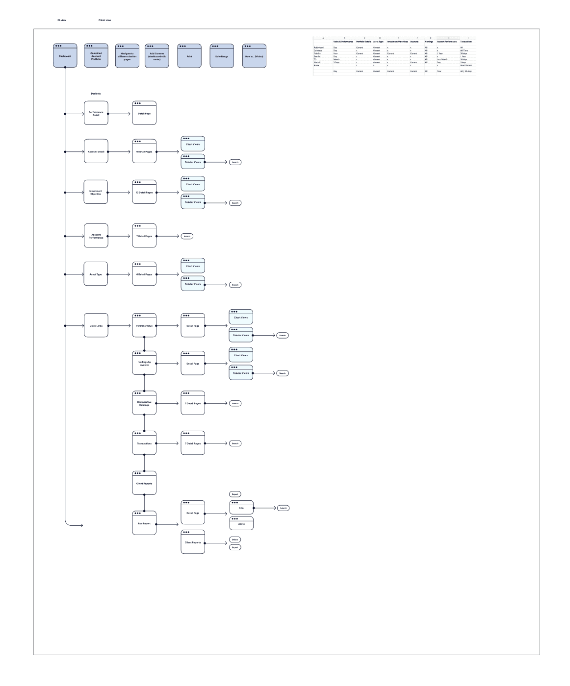
A screenshot of the sitemap exercise.
Low-fidelity sketches of navigation
I then sketched different ways of navigating the product, with the starting point being a dashboard.


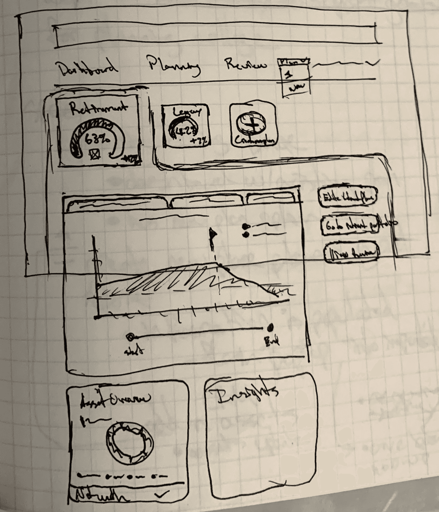
Deciding on a design direction
After a design critique, the team decided that we would move forward with the side navigation.
We felt this was the best option for a few reasons:
Navigation is easily discoverable
It ties all of the dashboard modules and product features to a common anchor
It is the industry standard navigation pattern for dashboards

Mid-fidelity wireframes
I then moved to Figma and started designing low-fidelity and mid-fidelity wireframes focused on the side navigation.


Usability Testing
Moderated usability testing
At this point, we wanted to get feedback on our design direction from current Albridge users.
Our method for testing was moderated remote usability testing, and we had 5 participants.
I set up the prototype and our research team facilitated the testing sessions.

A screenshot of the usability test session.
"It's hard to understand which dates
the data is being pulled from."
-Participant A
"I really like the data highlights at
the top."
-Participant D
Every participant was able to complete the research tasks and we also got feedback on parts of the design that felt confusing. The positive outcome and actionable insights were enough for my team to receive buy-in from our client, BNY Mellon.
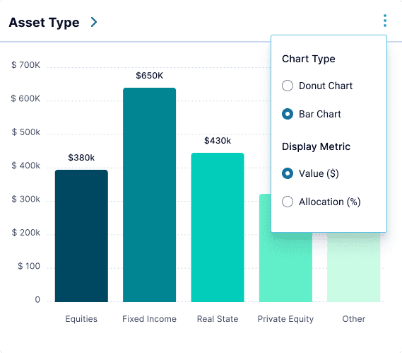
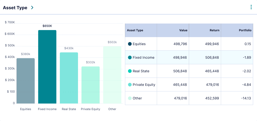
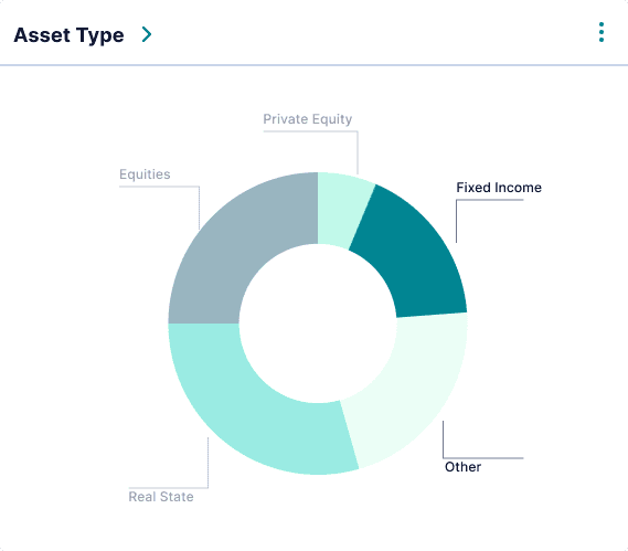
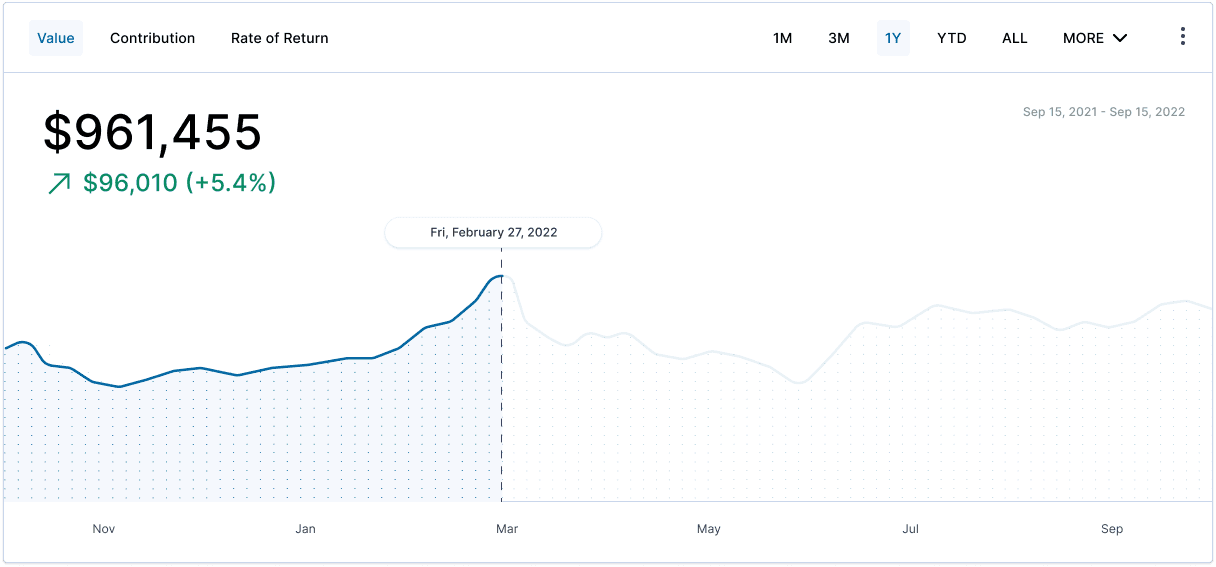
Visual Design and Data Visualizations
Incorporating feedback from the usability testing
After incorporating the usability feedback, I continued to elevate the design into high fidelity and began incorporating data visualizations for the dashboard modules.
The Final UI


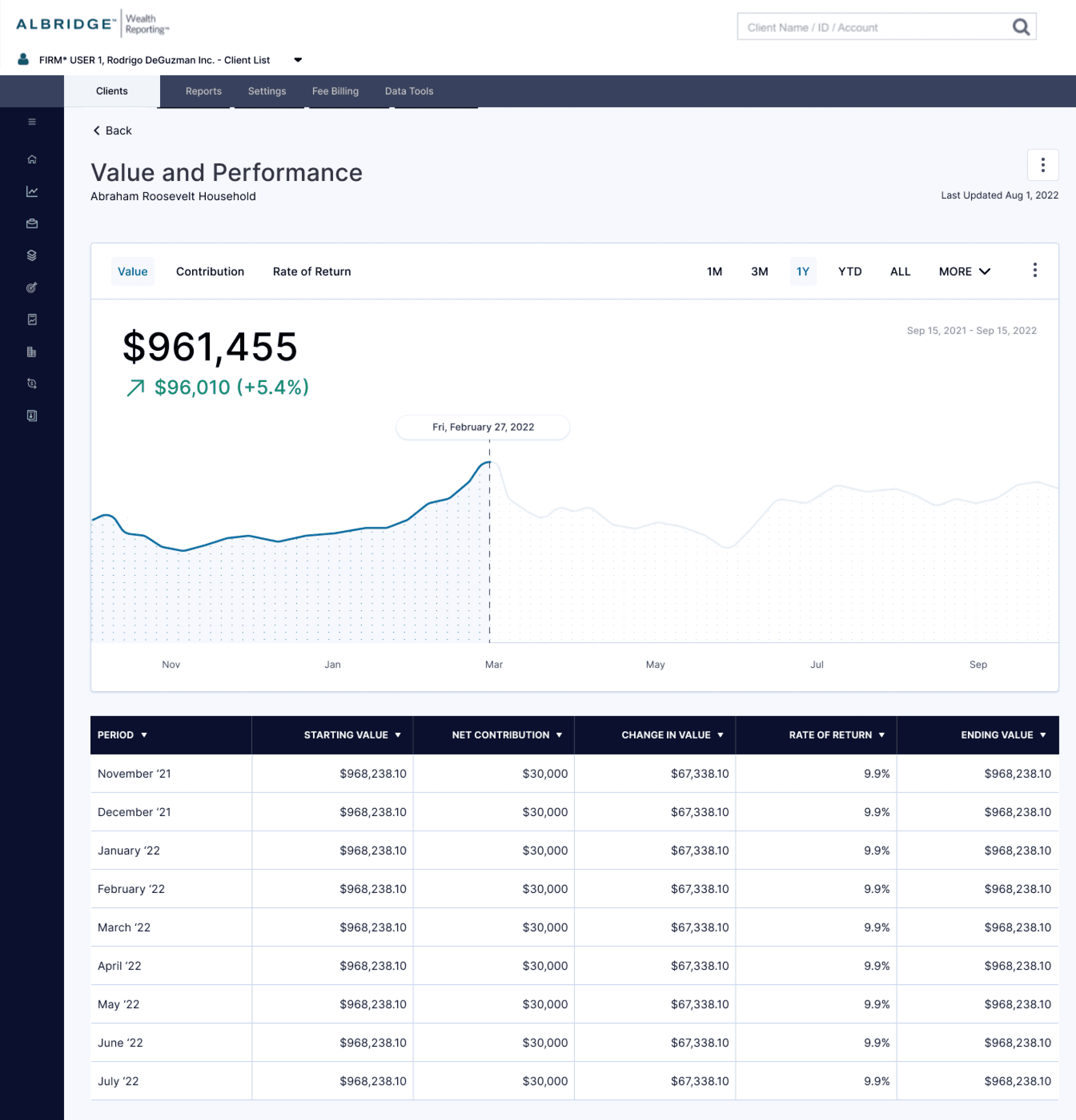
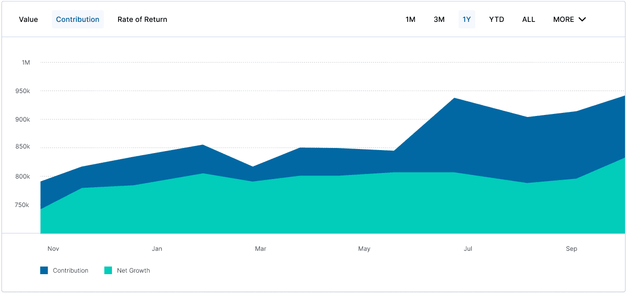
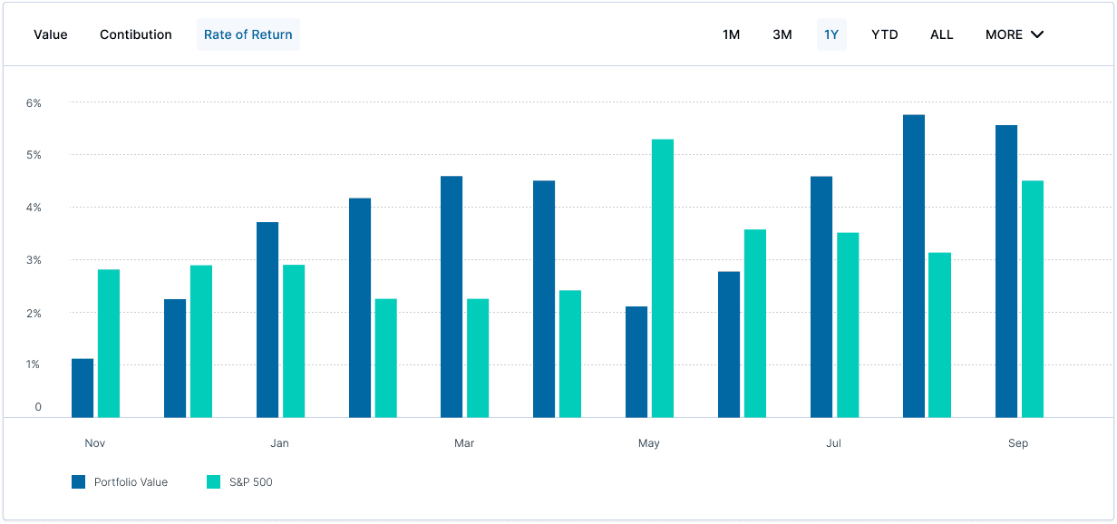
A closer look at the data visualizations


Handing off to the Engineering Team
In the final phase of this project, I focused on ensuring a seamless handoff to the engineering team.
Throughout the project, we had weekly updates with the engineering team so this phase didn’t involve any heavy lifts. We prioritized collaboration throughout the project, regularly checking in to address any queries and provide clarifications.
This approach not only facilitated a smooth transition from design to development but also reinforced the importance of cross-functional teamwork in achieving a cohesive end product.
Thank you for reading.